
Designer's interview
My goal was to create a medical device with a beautiful design.
Atsushi Nakada
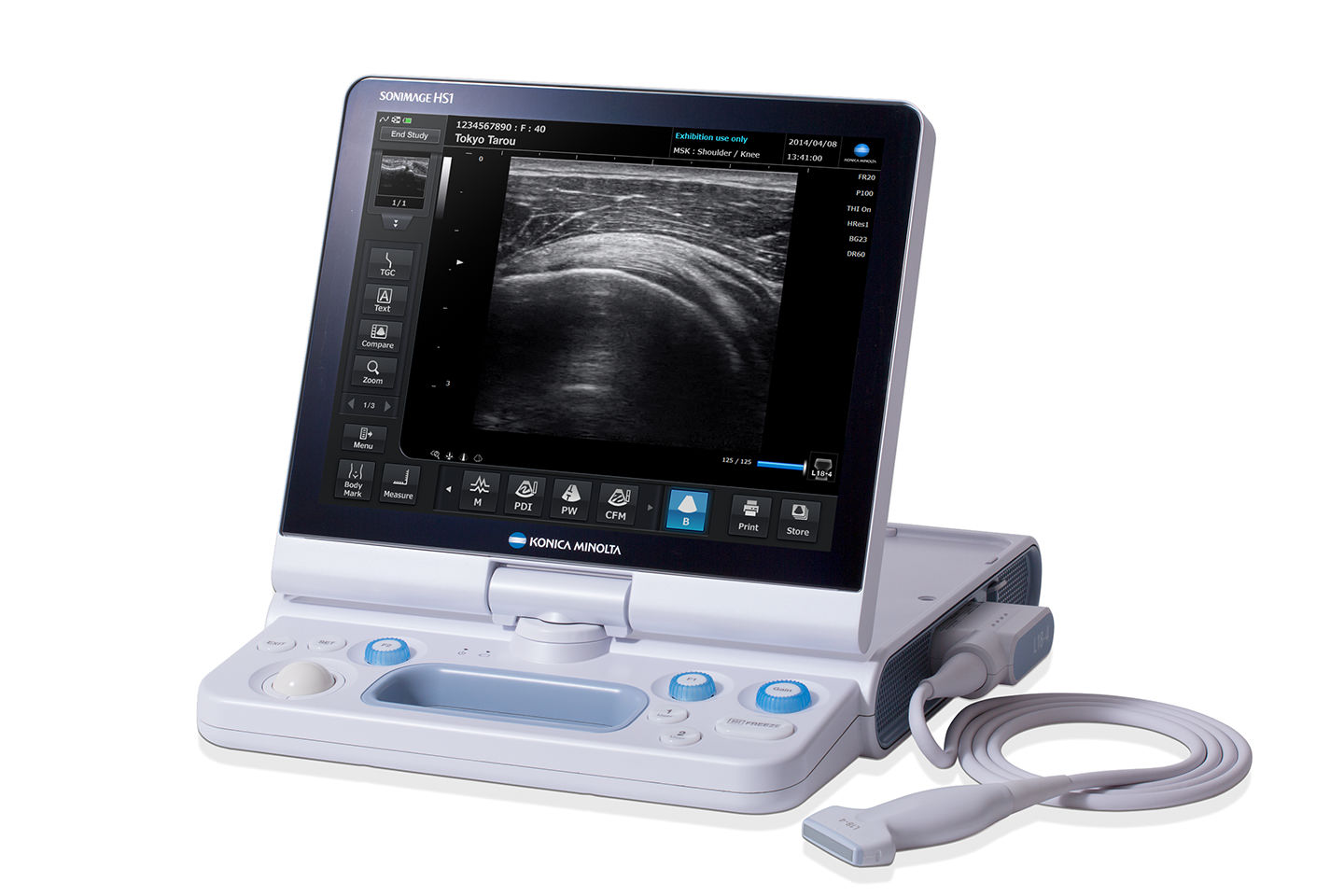
SONIMAGE HS1 ultrasonic diagnostic imaging system
Ultrasonic diagnostic imaging systems generate ultrasonic waves from a probe that is placed in contact with a part of the body and generate images from the reflected waves that result. Since this approach isn’t stressful for the patient and since it allows images to be diagnostically analyzed in real time, it’s used in a broad range of clinical settings, including internal medicine, obstetrics and gynecology, and orthopedics. The SONIMAGE HS1 delivers high resolution in a portable design that broadens the diagnostic environment by allowing the system to be moved between rooms at medical facilities, brought to patients’ homes, and even used outdoors.
Fresh, accurate information as the lynchpin of medical device design
I work primarily on designing graphical user interfaces (GUIs) for medical devices, a product category where fresh, accurate information is very important.
For example, if I'm going to create an icon, I need to have a correct understanding of what types of diseases the underlying function is intended to address, and of what types of patients it’s intended to be used for. Medical devices are used under a variety of conditions, in bright examination rooms and hospital wards as well as in dim laboratories. Additionally, patients may look at the screen or interact with it directly.
To gain this kind of information, I ask engineers who have studied the subject in more detail and read specialized literature, but I feel it’s also important to visit hospitals so that I can talk to physicians and technicians and see where these devices are actually used. I encounter lots of specialized jargon during such visits. I can’t ask about each as I hear it, so I always prepare for visits by doing some research in advance. I believe that such research is an essential part of the design process.
Striving to design devices that are easy for physicians to use and easy on patients
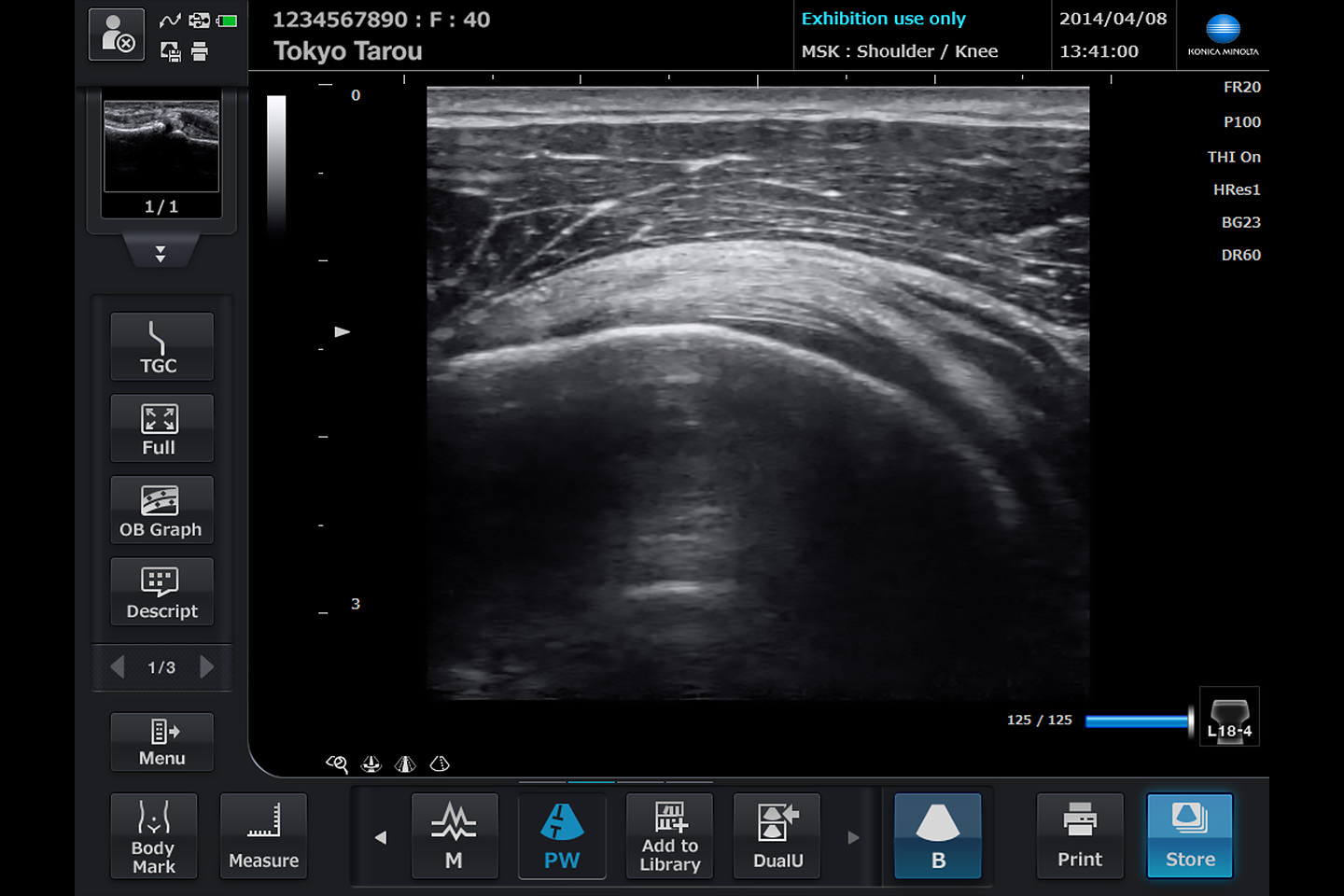
Early in its development, the SONIMAGE HS1 had a brighter and more vivid screen. However, when I went to check on how it was actually being used, I learned that people found the blinding screen to be tiring. As a result, we reduced the saturation of the colors and added functionality to allow users to adjust the brightness to their liking. I thought that I understood the environment in which the device was used, but it turned out that I didn’t know as much as I thought I did. That sort of difficulty keeps things interesting.
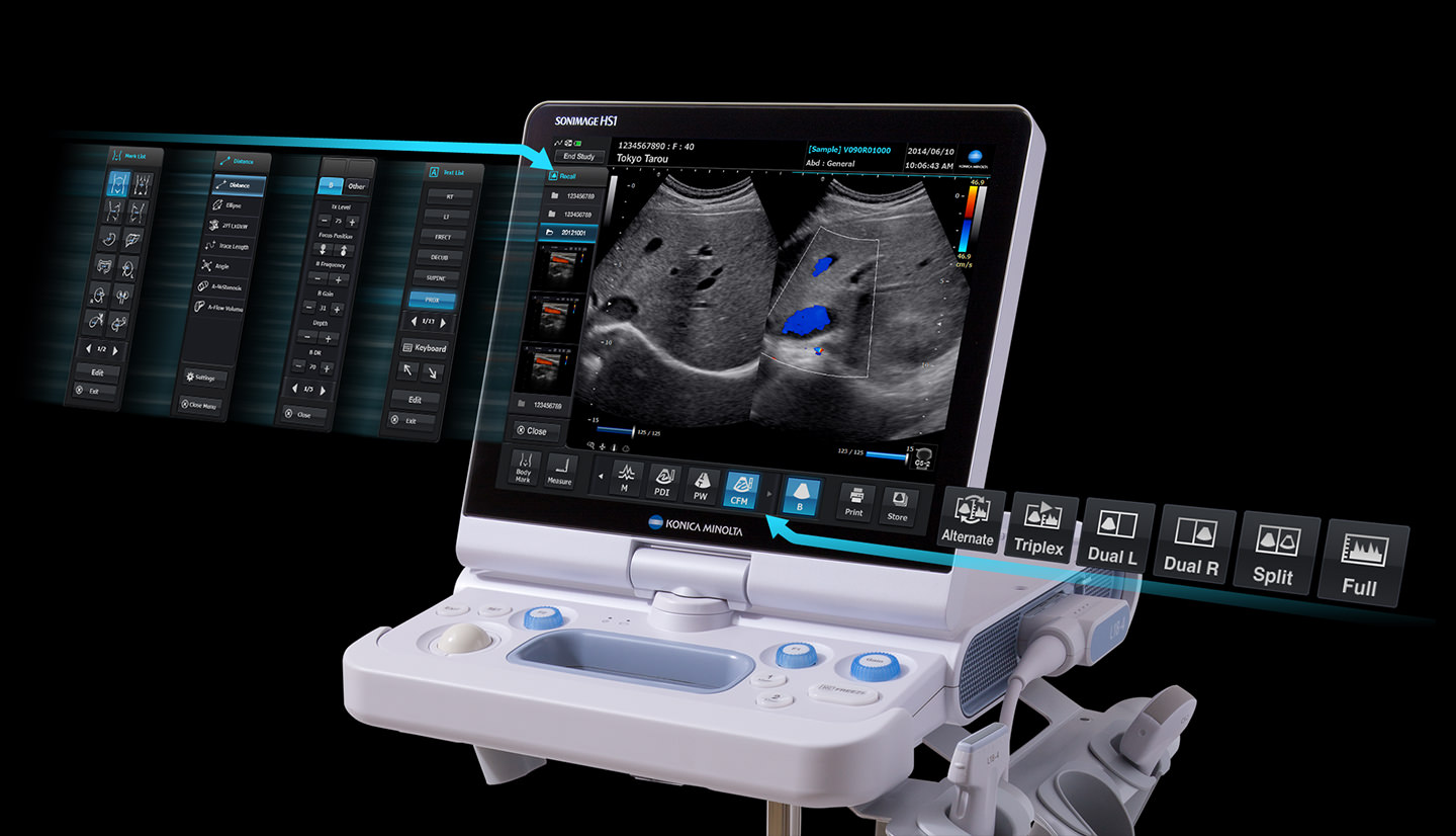
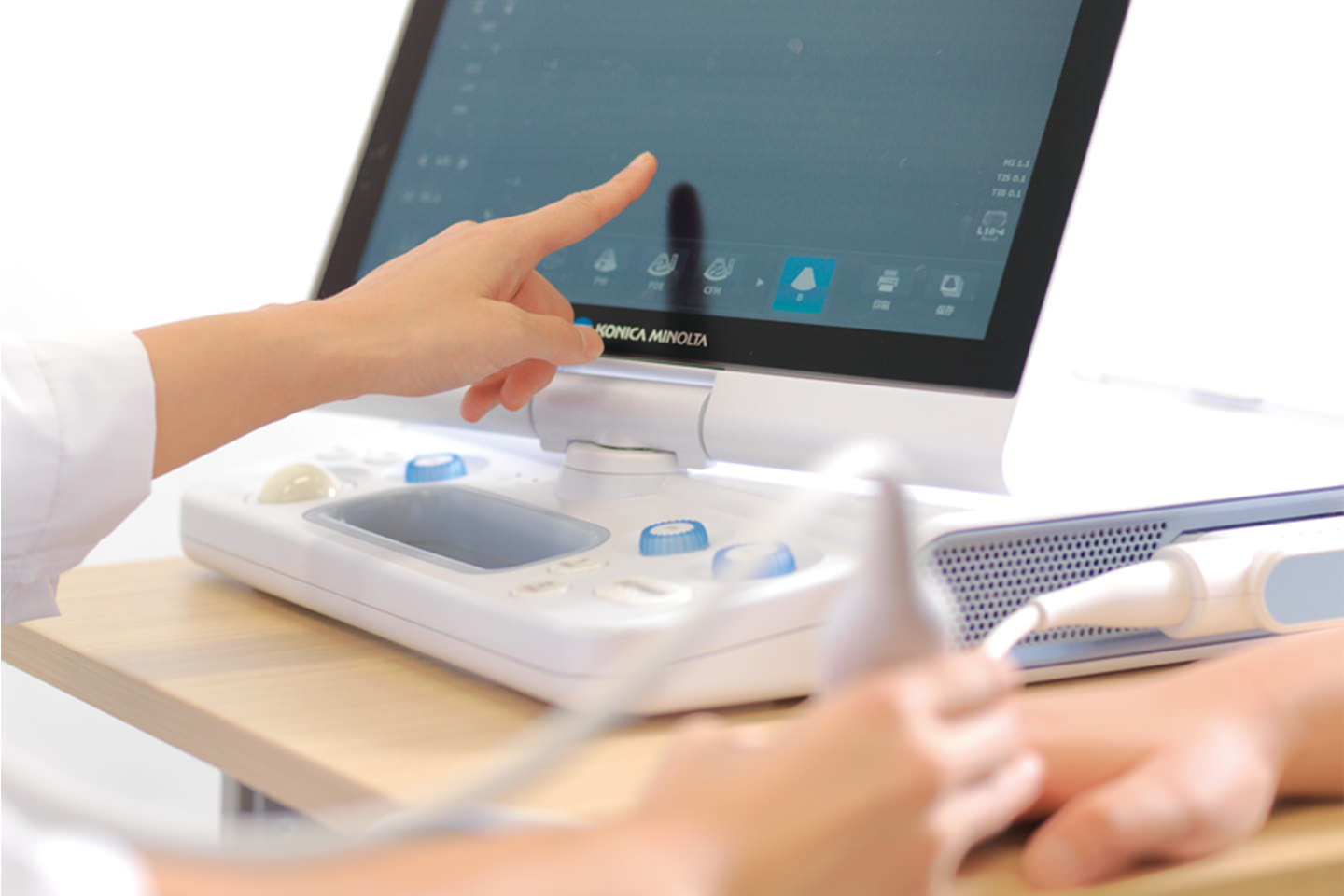
The SONIMAGE HS1 is packed with functionality, but its use of a touch panel control screen means we can surface only those functions that are necessary while hiding those that aren’t normally used. By limiting the number of choices offered to the user and thereby making using the device less confusing, this design was intended to make the examination process pleasant for physicians and technicians and easier on patients.
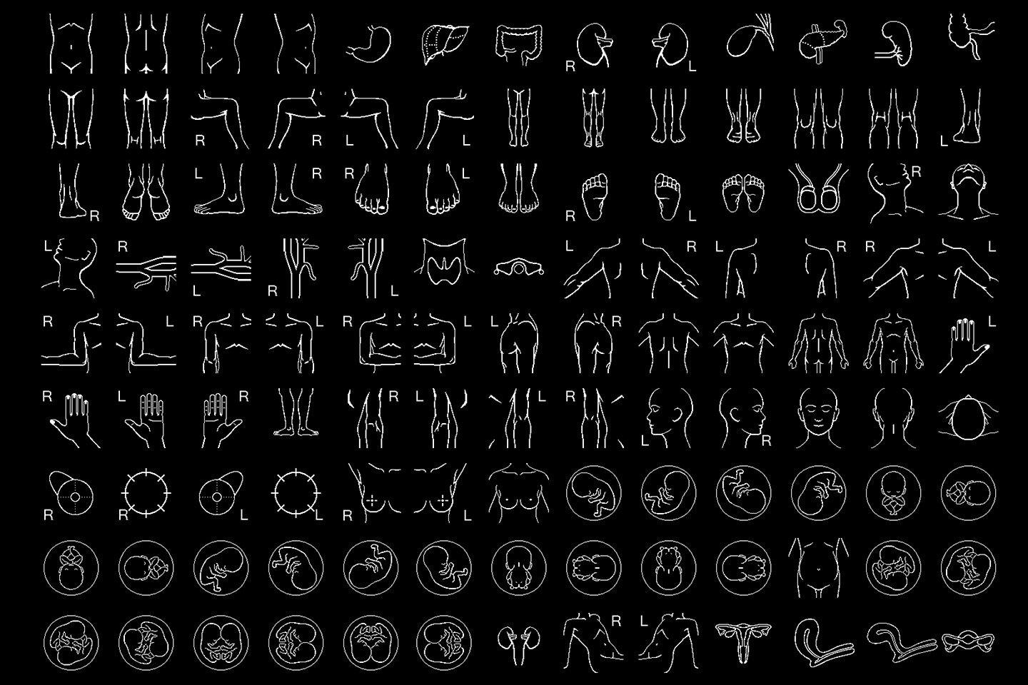
I also worked to make the screen familiar and approachable due to the possibility that patients would see it. For example, an icon depicting a fetus could look frightening if used on a screen with a black background. To avoid worrying pregnant mothers, I used an icon that had a bit of a facial expression. Considerations like that embodied the sort of kindness that the device needed to have, so it was an area where I paid special attention.