Designer's interview
Giving shape to the beauty of functionality through the power of design
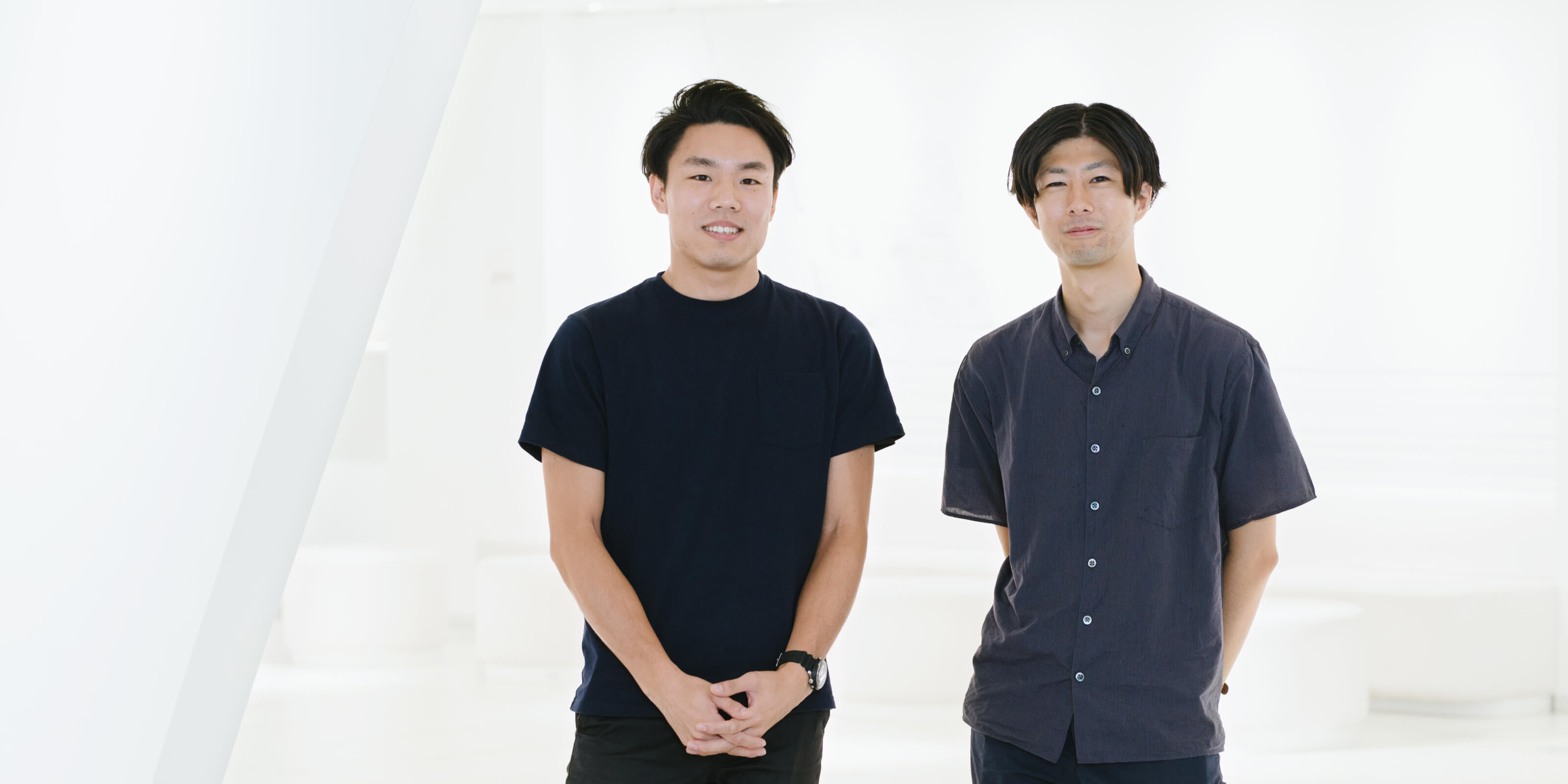
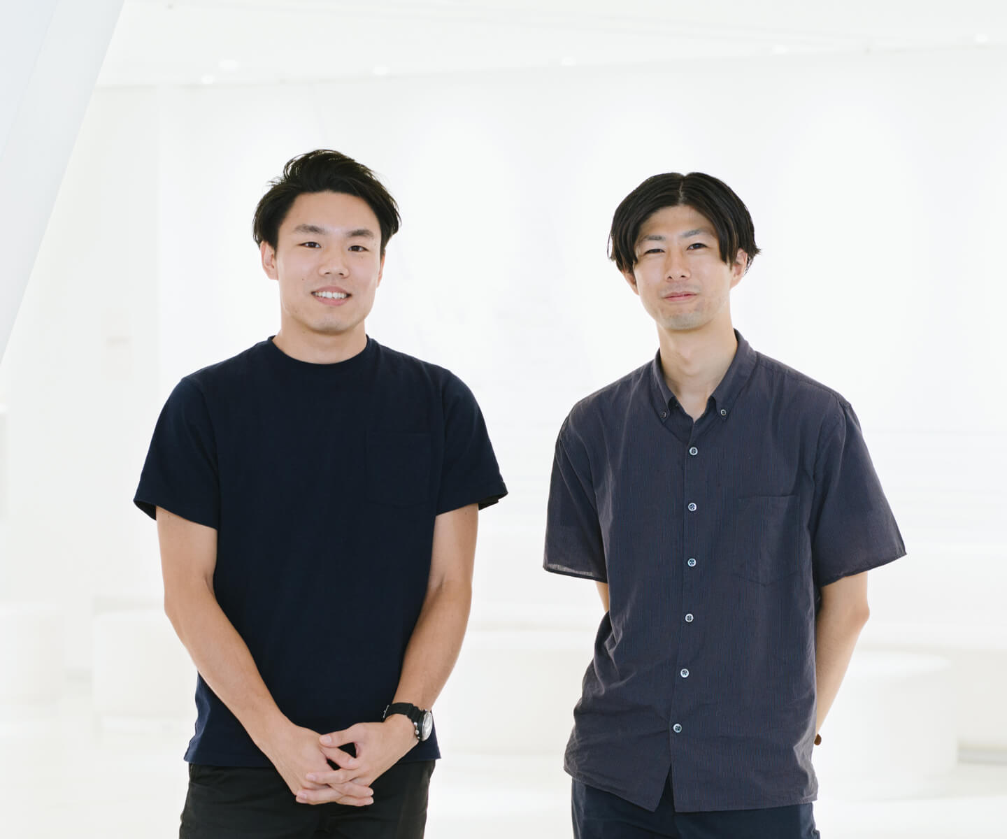
Jun Shibayama
Product and logo design, new business creation, and related responsibilities
×
Naoaki Iwamatsu
Product design, new business planning and promotion, and related responsibilities
Supporting businesses and people who need design
Iwamatsu: I was involved with a collaborative project that brought together industry and academia during my days as a college student, and that project gave me experience in BtoB product design in a manufacturing setting. It also let me experience the social significance of doing design work for people at companies that had no, or only a few, designers. Konica Minolta’s Design Center is involved with numerous BtoB projects, and it was my feeling that working there would allow me to help people who had a strong need for the power of design that made me decide to join the company.
I'm currently involved in new business planning and promotion, with a focus on product design.

Seeking authentic design by pursuing functional beauty
Shibayama: After studying industrial design in college, I worked as a new graduate at a design company, where I was involved with designing audio equipment like earphones and headphones. The thing with BtoC product design is that differentiating your product from competitors’ products is important, and designers tend to turn to ornamental designs to give their products a distinctive appearance. I eventually realized that I wanted to pursue authentic user needs and functional beauty more actively, and that was the basis of my decision to transfer to Konica Minolta, where I could work in BtoB design.
Right now, I'm primarily involved with product design in the sensing and healthcare domain.

Working together to create a redesigned product
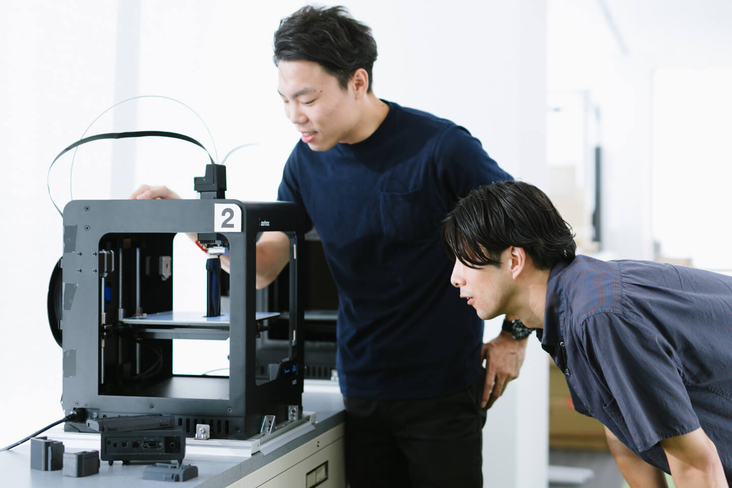
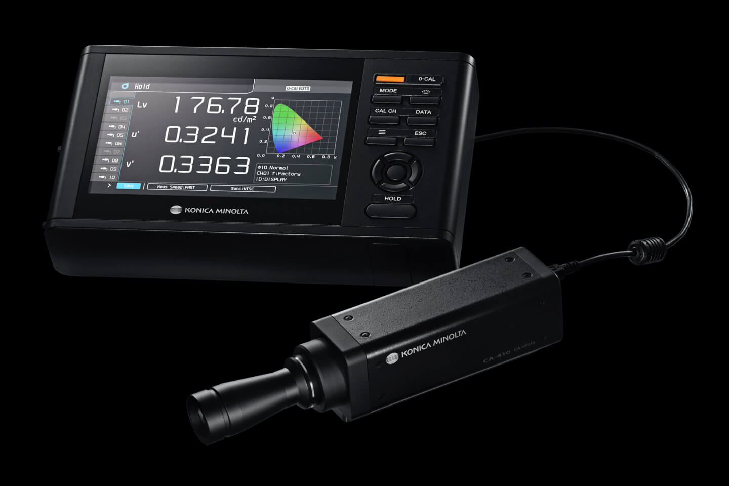
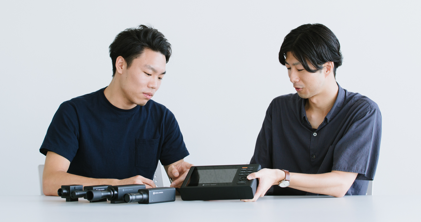
Iwamatsu: I worked with Shibayama-san on the design of the CA-410 display color analyzer. Display color analyzers are used to measure the light and color produced by LCDs and other displays, and in this case, the product was being redesigned for the first time in 15 years.
I was responsible for the design of the analyzer. For the overall direction of the design, our team developed a vision for what the next-generation version of the product should look like, and then we applied that to commercialize the product.
Shibayama: I was responsible for the design of the CA-410’s probe (light sensor).
We’d create a mockup and then receive feedback from the business unit, at which point we’d create another mockup... We refined the product by repeating that process.
Dedication to a slim and consistent design
Iwamatsu: Our key tasks in redesigning the product were to enhance its functionality and improve its usability. In order to significantly increase the number of terminals to which probes could be connected, we left only the minimum number of hardware buttons and moved the rest “inside” the device by creating a streamlined user interface (UI) layout.
Then we aggressively slimmed down the enclosure until the new model was about 70% the size of the previous model so that it delivered high-performance specifications in a portable package.
Shibayama: I focused a lot on the color and material used for the probe. The previous model was black and used a silver probe, but I suggested to the business unit that we use black for both so that anyone would understand at a glance that both components belonged to the same product.
Reflecting the change in color, we chose a granular, leather-like texture for the material, the kind of texture you see on a camera. This material has the advantage of limiting reflections from the analyzer, and I feel that we were able to achieve a design that combines an attractive appearance with functionality.

Incorporating a design philosophy into products
Iwamatsu: In most projects, I try to gain a good understanding of the needs of the people who will be using the product, and then I build that into the design in a rational manner. For this reason, I place great importance on looking at the design objectively and asking whether it contains beauty that you can see on an intuitive level. That kind of authentic beauty communicates a product’s seriousness at a glance, even if it’s not described in words.
Precisely because it’s a BtoB product, which means it’s a tool that users don’t choose on their own, I’m careful about not only usability, but also beauty of appearance.
Shibayama: I think that beauty comes about naturally when you create shapes that incorporate the necessary elements and nothing more, nothing wasteful. That’s why I'm always conscious of the need to avoid creating ornamental ""design for the sake of design.” Working at the Design Center means I can get involved with products in a variety of areas, which I feel broadens my skills as a designer and fuels my motivation. I look forward to pursuing design in a way that gives meaning to all shapes while deepening my learning through my daily work.