

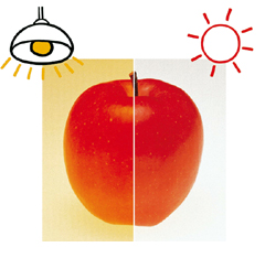
An apple which looks so delicious under sunlight in front of the green grocer somehow doesn't look so good
under the fluorescent lights at home. Probably many people have had such an experience.
Sunlight, fluorescent light, tungsten light, etc.; each type of illumination will make the same apple look different.
Precise Color Communication
 |
  |
If the apple is placed in front of a bright background, it will appear duller than
when it was placed in front of a dark background.
This is referred to as contrast effect, and is undesirable for accurately judging color.
When looking at a car, viewing the car from just a slightly different angle can make a point on the car
appear brighter or darker. This is due to the directional characteristics of the car's paint.
Certain coloring materials, particularly metallic paints, have highly directional characteristics.
The angle from which the object is viewed, and also the angle from which it is illuminated, must be constant
for accurate color communication.
The sensitivity of each individual's eyes is slightly different;
even for people considered to have "normal" color vision, there may be some bias toward red or blue.
Also, a person's eyesight generally changes with age.
Because of these factors, colors will appear differently to different observers.
After looking at small sample pieces and selecting a wallpaper which looks good,
people sometimes find that it looks too bright when it's actually hung on the wall.
Colors covering a large area tend to appear brighter and more vivid than colors covering a smaller area.
This is referred to as area effect. Selecting objects which will have a large area based on color samples
having a small area may result in mistakes.
|
| 2/13 | ||
|
|