
INNOVATION STORIES
DESIGN
Designs—Always an Integral Part of Products and Services,
Brands, and Customer Experience
- INDEX
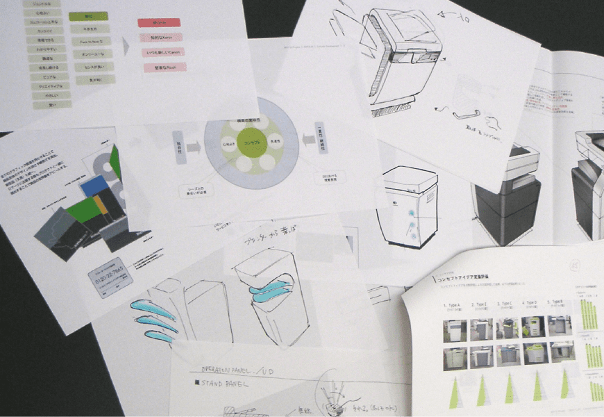
Since the founding of our company, designs have been closely associated with all products and services. Some designs helped make a big hit or served as catalysts that overturned industry norms. The work of designing tends to be considered only as producing the final shape, such as products and promotional items. However, it is also an essential part of corporate branding and the upstream process of developing products and services. Our Design Center covers extensive fields, including product design development, brand management, and customer experience designs.
As a company with a long history, we look at three examples of the roles that the Design Center played on and after the birth of the Konica Minolta Group in 2003.
Making the logo to be a symbol of management integration
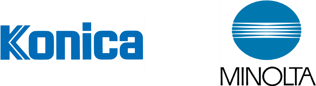
Perhaps it was employees who were most surprised by the announcement of the logo for the new company, which was established through the management integration of Konica and Minolta in August 2003, because the symbol above the “Konica Minolta” logotype was a blue “globe mark,” which was known as Minolta’s logo. In a management integration, it is extremely unusual to adopt the logo of the counterpart of the succeeding company.
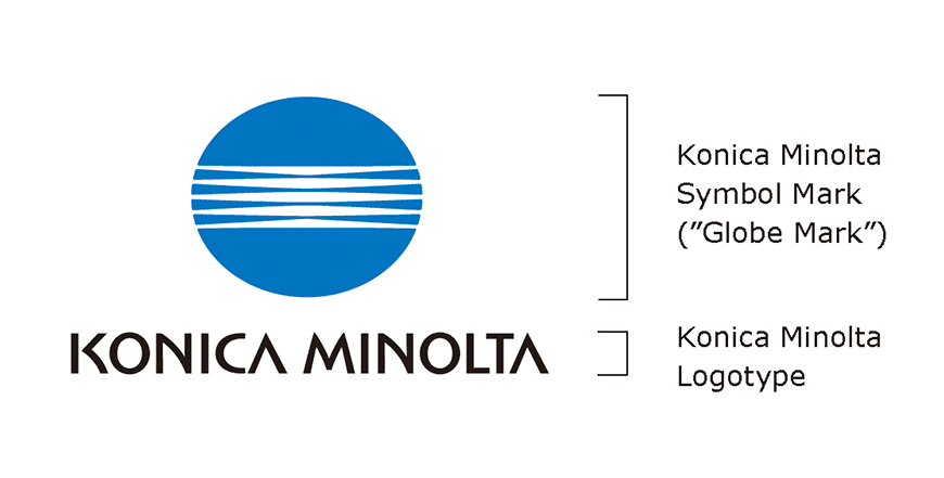
Work on designing the logo of the new Konica Minolta started shortly after the announcement of the integration in January 2003. Members were mobilized from the design divisions of the two companies. At first, they worked on designing the company name logotype only. Executives were interviewed to confirm the vision of the design, and they unanimously stated that: “A design which gives an impression that either of the two companies is superior or inferior is unacceptable.” Reflecting on that time, the staff members in charge said they were keenly aware of the executives’ wish to make the logo a symbol of the integration. This led to the decision to design the logo jointly by the design divisions of the two companies, instead of commissioning the design to an external advertising agency.
However, it was difficult to decide on a logo, which is the key to branding, only in-house in a short period. A graphics expert was invited as an observer to join the study on condition of anonymity. In March 2003, two draft designs were selected and proposed to the top management. The result was unexpected. It was decided to combine the selected logotype with Minolta’s globe mark. Fumio Iwai, who was the former president of Konica and became the first president of Konica Minolta, said at the time: “This decision is based on the results of in-depth studies on the effect and cost of creating and spreading a new mark. Above all, the more carefully I look at the mark, the more it seems well designed. I am captivated by it.”
The logo was designed by Mr. Saul Bass, a well-known American graphic designer. It was introduced in 1981 as part of Minolta’s efforts to promote corporate identity (CI). The globe mark, which used Earth as a motif and featured light in the center, also matched the managerial visions “Innovative Corporation That Continues to Create Impressions in the Field of Imaging” and “A Global Market Leader That Offers Advanced Technology and Reliability” of the new company. While the shape of the mark remained the same, a reddish tint was added compared to the Minolta logo after thorough consideration. The color of “innovation blue” was decided to represent unique innovation. This was at the end of May 2003.
Later, various applications of the logo, including products, signboards, business cards, and websites, were studied and the CI manual was created. The company finally announced the logo in August 2003.
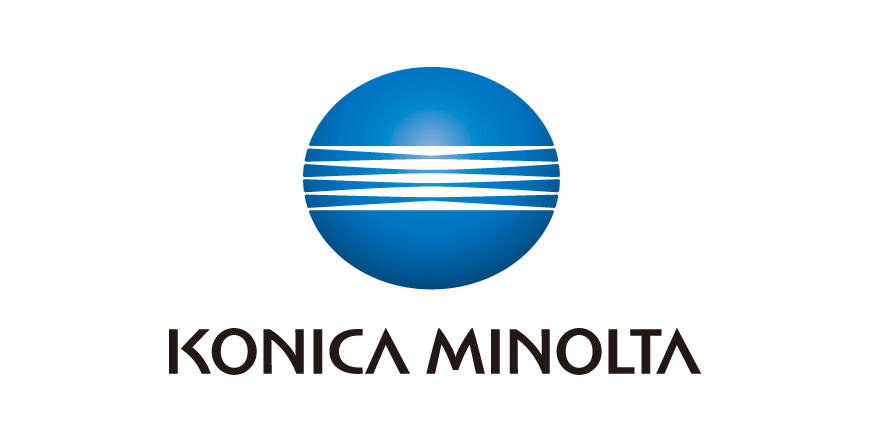
In 2006, a 3D type globe mark was developed in line with market trends and to ensure
continuity with
display on products
. This is designated as the priority logo at present.
Designing the information flow
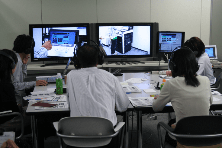
We dramatically changed the design of the bizhub series, which are MFPs for offices, from the bizhub C550 color MFPs released in 2007. Previously, the standard color of office equipment was white, but we daringly proposed a stylish body with black as the base color and featuring white lines. This marked the start of the bizhub design concept, which continues in the current models.
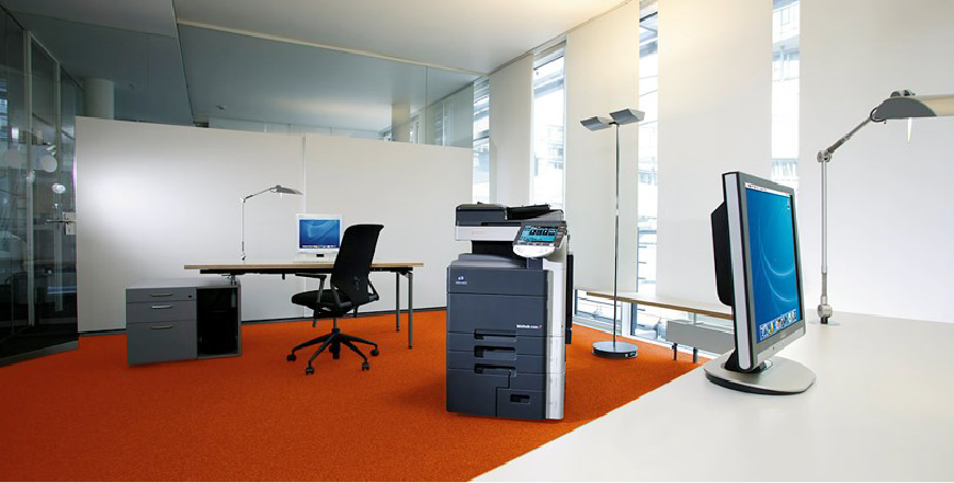
This innovation was brought about by the increase in network devices with the spread of the Internet and diversification of workstyles at offices. At that time, the offices of pioneering companies were starting to break away from the standardized layout with the aim of attaining both efficiency and comfort and improving intellectual productivity by creating various zones in offices and encouraging interaction among employees. This was also accompanied by changes in the way MFPs were used in offices. MFPs, which had previously been tucked away in the back, started to be placed at the center of offices where they could be easily accessed by anyone.
Two design concepts were introduced in response to these developments. One was the black-and-white coloring, which blends with the interior of various offices, and the other was the all-around design, which enabled the machines to be placed anywhere thanks to the properly designed rear side as well. The color scheme based on the combination of black and white had a meaning beyond mere beauty. The white lines, which were arranged as a fringe on the black body, were regarded as “information lines” representing the flow of information handled by users. An operation panel was arranged on the line, and the display of operation status was consolidated. Blue blinking lamps visualized the jobs in progress, such as reception of data and printing, enabling visual perception by users.
Because of the entirely new design, it was essential to help the sales division understand the concept before marketing the product. Thus, the members of the Design Center split up to visit sales companies in respective countries and hold workshops, where they started to receive feedback from sales staff: “We now understand that the design takes into account both appearance and user friendliness,” and “The design is another function in addition to printing speed and image quality.” As a result, the series was a big hit.
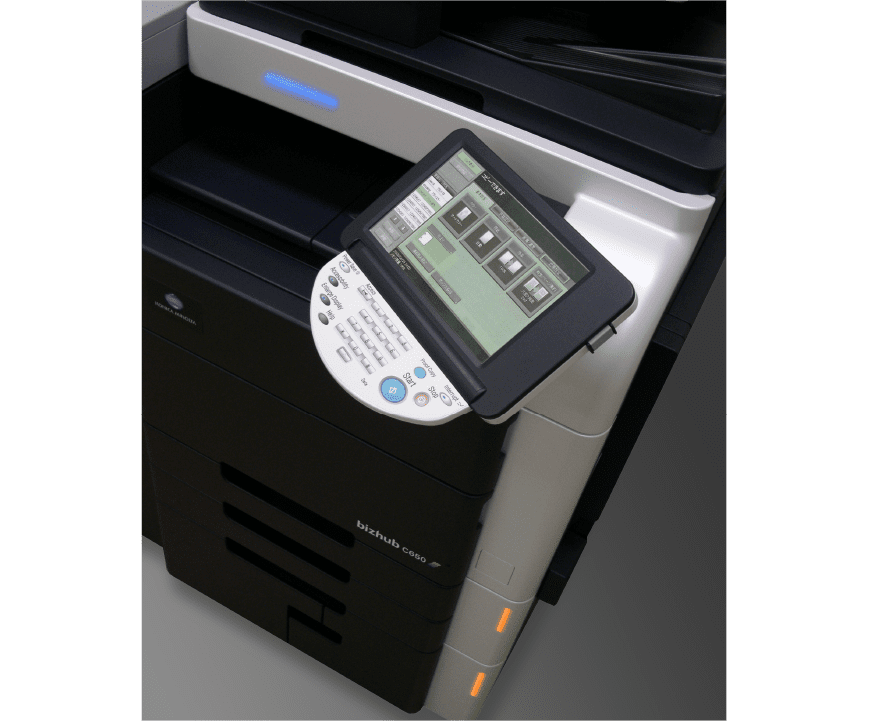
Afterwards, the design of the bizhub series continued to evolve while focusing on the touchpoint with users. The INFO-Palette, which has been used since 2013, is a good example. To enhance user friendliness in line with the increase in applications due to the expansion of services offered by MFPs, the touch panel design was reorganized into a visual that looks like a painter’s palette. The basic layout of the operation screen was standardized even for different applications, including photocopying, faxing, and scanning, to ensure consistency among operations. The touch panel was designed to guide users to functions that they wanted to choose without getting lost by simply presenting the necessary information. Today, the INFO-Palette concept is also used in the design of software and applications, which are used to operate MFPs from personal computers and smartphones, to ensure the same ease of operation.

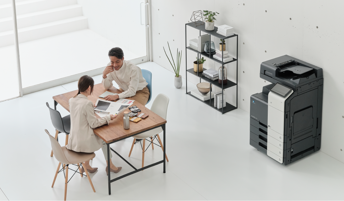
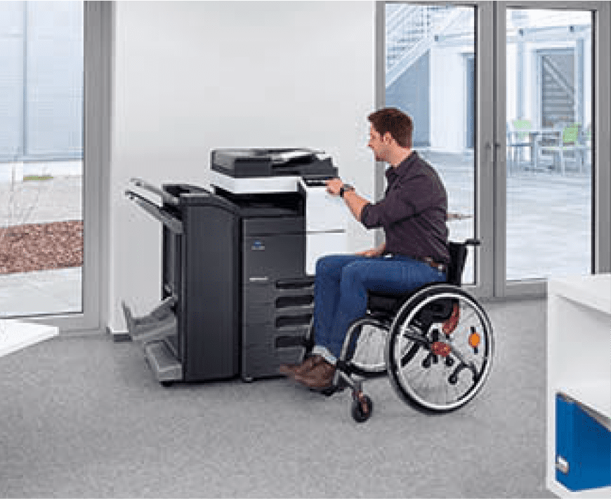
In addition, the development system was reviewed for the full model change in 2019. Previously, development had proceeded for each model, such as A4 and A3 models, but the design was unified for the entire series. For example, improvements to the operation panel included enhancing its presence by floating the touch panel from the body, increasing the maximum tilt angle of the panel to 90° to make it easy even for wheelchair users to see the screen, and standardizing the UI across the lineup to unify the operation experience. The customer experience is enhanced to meet the needs of the times while inheriting the accumulated brand assets, and this evolution still continues today.
Human-centered design approach
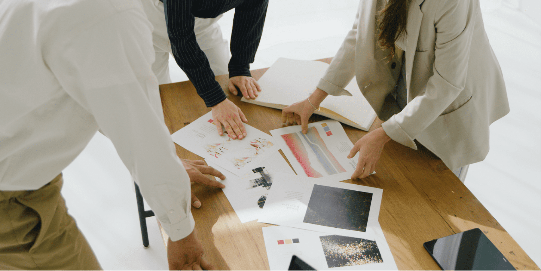
In business, it is important to focus on the human side together with the business side and the technology side. The methodology or approach to focus on the needs, requirements, and behavior of users in designs is referred to as “human-centered design.” The process is as follows: issues faced by users are identified by observing users and sites; a hypothesis is formulated to solve the issues; user friendliness is verified using mockups and simulations based on the hypothesis; and feedback is gathered to make improvements. The Design Center has refined the user-friendly shapes of equipment and highly visible display methods on screens by repeating this process.
During product development, even if we believe we have ensured ease of use, users may still struggle to use our products or find them difficult to use. To avoid such misconceptions by the manufacturer during development, human-centered design, which starts with observing users, is indispensable. Minolta started to focus on universal design in the 1990s. Improvements were made by asking wheelchair users and visually impaired people to operate our copiers. Konica also launched a project in 2002 to conduct evaluations by asking various types of users to use MFPs in order to develop a graphical user interface (GUI) that is easy to use.
In some projects, the Design Center participates from the initial stage of development. If we start by considering users’ issues with a sense of ownership, it is easier to share the development vision even among staff members in charge in different divisions. Even if there are conflicting needs, consistent efforts toward the goal can be made. We believe that a coherent brand experience can be offered with seamless support from the Design Center throughout the process, from the conceptual study phase, to promotion, to delivery to customers.
We are in the B2B business, but our products and services are used by individuals. We aim to offer a better user experience through design efforts that start by considering individuals.
In the interest of clarity, “Konica” and “Minolta,”—the trade names that were used before the merger that formed “Konica Minolta”—are used throughout this text. Each company underwent a number of name changes throughout their history.
Design Pickup
35mm SLR
MINOLTA α-7700i (1988)
The second generation AF SLR model developed in collaboration with Hans Muth, a German designer famous for his motorcycle and car designs. As a pioneer of ergonomic design that pursues a sense of oneness with the user and comfort in operation, the shape of the grip and the shape and position of buttons that are easy to press became the basis for subsequent SLR camera designs.
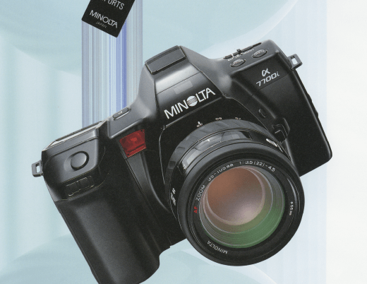
MINOLTA α-7700i
Compact Camera
Konica/DIGITAL Field Supervisor DG-2 (2002)
Since the first film camera dedicated to construction documentation was released in 1988, this series has been updated in response to feedback from users in the field. The DG-2 has a waterproof rating of Japanese Industrial Standards protection class 7, dustproofing, a grip shape that allows a firm hold, a hard rubber exterior that prevents slipping even when wet, and large switches that are easy to operate even with military hands, all of which have earned it a reputation as a reliable design for harsh construction site environments.
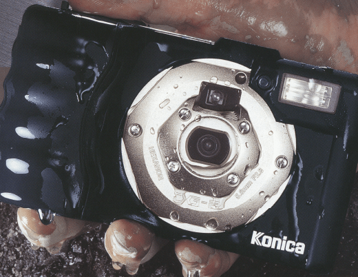
DIGITAL Field Supervisor・DG-2
Konica Minolta Planetaria TOKYO
(Opened in 2018)
A dome theater complex consisting of a dome that experiments with new possibilities (DOME1) and a traditional planetarium dome (DOME2). While DOME1 allows flexible layout changes, DOME2 symbolically uses blue-green to create a classical space. This is the color used in the laboratory of the 18th century Dutch astronomer who created the world's first planetarium, and the space expresses respect and appreciation for the planetarium's accumulated history.
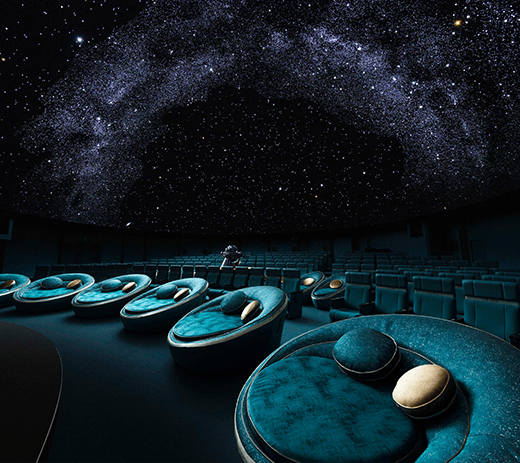
Konica Minolta Planetaria TOKYO DOME2
High-speed digital label press
AccurioLabel 400 (2022)
It simplifies tasks that used to require specialized skills, such as color matching and equipment maintenance, to improve operational efficiency. This not only minimizes time loss at the printing site, but also significantly shortens the training period for operators. The label storage sections on both sides have been changed from the conventional storage type to a protruding type, creating a light impression that is difficult to achieve with industrial equipment. Those features have been appreciated and it has won many design awards.
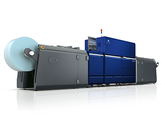
AccurioLabel 400